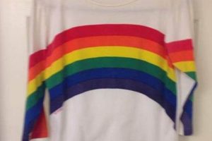
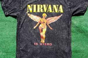
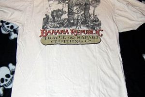
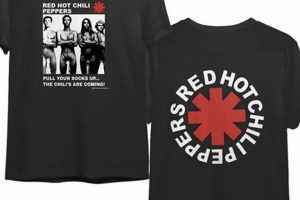
Creating apparel that evokes a sense of nostalgia involves carefully selecting graphics, fonts, and garment styles reminiscent of past eras. The goal is to produce clothing that appears aged and worn, mirroring the aesthetic qualities of garments from decades gone by. This often includes using faded colors, distressed textures, and iconic imagery associated with specific historical periods.
The appeal of this aesthetic lies in its ability to connect with consumers on an emotional level, tapping into a sense of history and authenticity. It provides a unique way to express individuality and can serve as a conversation starter. This approach benefits designers by offering a broad range of inspirational sources, from mid-century modern patterns to 1970s rock and roll aesthetics. Furthermore, the historical context allows for rich storytelling opportunities, enhancing the narrative surrounding the apparel.
Understanding the nuances of successfully recreating this aesthetic is essential for designers and businesses seeking to capitalize on its enduring popularity. Subsequent sections will delve into specific techniques for achieving an authentic aged look, exploring the significance of color palettes, and discussing the ethical considerations involved in appropriating historical styles.
Essential Considerations for Aged Apparel Creation
Producing apparel with an authentically aged appearance requires careful attention to detail and a deep understanding of design principles. The following tips provide a framework for achieving a convincing and appealing vintage aesthetic.
Tip 1: Textile Selection: The foundation of a vintage aesthetic begins with the proper material. Opt for fabrics such as ringspun cotton, known for its soft feel and ability to accept dyes and washes that create a faded appearance. Consider heavier weight fabrics to replicate the durability associated with older garments.
Tip 2: Color Palette: Authentic aged colors are typically muted and desaturated. Focus on earth tones, washed-out blues, and faded reds. Avoid bright, neon colors, which are inconsistent with a historically aged appearance. Reference historical color charts from the intended era for accurate color selection.
Tip 3: Graphic Distressing: Apply distressing techniques to graphics to simulate wear and tear. This can include using crackle inks, softening agents, or deliberately misregistering screen prints. Such methods lend the impression of age and frequent use.
Tip 4: Print Placement: Consider print placement carefully. Historically, printing techniques and placement differed from modern practices. Research garments from the desired era to determine appropriate placement styles, such as smaller chest prints or off-center designs.
Tip 5: Wash and Treatment Processes: Garment washing is crucial for achieving a worn appearance. Enzyme washes, stonewashing, and acid washes can soften the fabric, fade the colors, and create subtle distressing effects. Experimentation with different wash techniques is vital to achieving the desired outcome.
Tip 6: Font Selection: The typography used in graphic design is just as important as the graphic itself. Make sure the typography chosen makes sense to the era you are emulating. If emulating a band shirt from the 70s, make sure the typography is in sync.
By adhering to these considerations, designers can more effectively create apparel that captures the essence of past eras, resulting in garments that resonate with consumers seeking an authentic and stylish vintage aesthetic.
The subsequent sections will explore the practical applications of these considerations through case studies and real-world examples, providing a deeper understanding of the art and science of vintage-inspired apparel.
1. Era-Specific Graphics
The selection and implementation of graphics directly tied to a specific historical period are paramount in achieving a credible vintage aesthetic. These visuals serve as immediate indicators of a garment’s intended era, significantly influencing its perceived authenticity.
- Iconic Imagery and Motifs
The use of imagery strongly associated with a particular time is fundamental. Examples include mid-century modern geometric patterns, Art Deco designs, or 1980s new wave graphics. Such visuals instantly transport the viewer to the designated era, establishing a visual foundation for the overall garment aesthetic. Failure to accurately represent iconic imagery undermines the authenticity of the design.
- Historical Branding and Logos
Replicating or reinterpreting historical branding elements and logos demands meticulous accuracy. This includes font styles, color palettes, and overall design composition. Inaccuracies in these elements can detract significantly from the vintage impression. Careful research and attention to detail are essential when incorporating historical branding into garment designs.
- Cultural and Social References
Graphics referencing significant cultural or social events contribute depth and context. Examples include imagery related to specific music genres, political movements, or technological advancements. These elements provide a narrative layer, connecting the garment to the historical period it represents, adding layers of meaning and visual interest.
- Printing Techniques and Styles
The printing techniques employed must align with those used during the targeted era. This might involve screen printing techniques common in the 1970s, or halftone patterns reminiscent of earlier printing methods. This creates both visual appeal and authenticity. The selection of appropriate printing methods can significantly enhance the design’s overall impression.
These elements, when accurately researched and executed, transform a standard t-shirt into a tangible representation of a specific historical period. Era-specific graphics not only provide visual appeal but also contribute significantly to the creation of an item that authentically reflects a vintage design aesthetic.
2. Aged Fabric Texture
The textural qualities of the fabric significantly contribute to the perceived age and authenticity of apparel. Replicating the feel and appearance of aged textiles is therefore a crucial aspect of vintage apparel design. The correct fabric can transform a modern garment into one that evokes a sense of history and familiarity.
- Fiber Degradation Simulation
The appearance of worn fibers is a key indicator of age. Techniques such as enzyme washing or chemical treatments can simulate the effects of years of wear and laundering, creating a softened texture and faded color. This process alters the fabric’s surface, resulting in a subtle fuzziness and a reduction in color vibrancy, indicative of prolonged use.
- Distressed Surface Effects
Simulating surface damage contributes to the aged aesthetic. This includes creating small tears, holes, or worn patches in the fabric. Techniques such as sanding, abrasion, or laser etching can be employed to achieve these effects. The strategic placement of these distressed areas enhances the impression of age and wear, adding depth and character to the garment.
- Color Fading and Bleeding
The effects of sun exposure and repeated washing often result in color fading and bleeding, a characteristic of aged textiles. This can be replicated through specific dyeing techniques or washing processes. The intentional creation of uneven color distribution and subtle bleeding contributes to the perceived authenticity of the aged fabric.
- Fabric Weight and Drape
The weight and drape of the fabric also contribute to the vintage aesthetic. Heavier fabrics, common in older garments, possess a different drape than lighter, modern materials. Selecting fabrics with a specific weight and weave, and then manipulating their drape through washing or finishing techniques, can further enhance the perception of age.
Ultimately, achieving a convincing aged fabric texture requires careful consideration of material selection, processing techniques, and the specific effects desired. When these elements are harmonized, the resulting garment effectively conveys the intended vintage aesthetic, strengthening its connection to the past.
3. Muted Color Palettes
The deliberate use of subdued tones is intrinsic to apparel intended to evoke a sense of historical authenticity. These color choices significantly influence the perceived age and aesthetic of “design t shirt vintage”, impacting its overall believability.
- Desaturation and Fading Simulation
Colors found in aged textiles typically lack the vibrancy of modern dyes. Desaturation techniques, employed digitally or during the dyeing process, effectively mimic the effect of sun bleaching and repeated washing. Examples include converting saturated hues to their grayscale equivalents and then subtly tinting them with earth tones. In this context, “design t shirt vintage” benefits from the appearance of gently worn colors, suggesting prolonged exposure to the elements.
- Restricted Color Range
Historical eras often favored specific color palettes due to dye availability and prevailing aesthetic preferences. Limiting the color selection to reflect these historical norms enhances the garment’s credibility. For instance, a 1970s-inspired “design t shirt vintage” might feature mustard yellows, avocado greens, and burnt oranges, while a 1950s design could incorporate pastel blues, pinks, and mint greens. This restriction contributes to the overall vintage feel and aligns with established historical precedents.
- Earthy and Natural Pigments
Colors derived from natural pigments are frequently associated with older textiles, offering a sense of authenticity. The use of earth tones, such as browns, ochres, and muted greens, is common in vintage-inspired apparel. These colors tend to possess a warmer, less artificial quality, enhancing the garment’s aged appearance. A “design t shirt vintage” utilizing these pigments appears more grounded in history, resonating with the aesthetic sensibilities of past eras.
- Deliberate Imperfections and Variations
Uniform color application is often at odds with the desired aesthetic of “design t shirt vintage.” Introducing subtle variations in color density and tone can mimic the imperfections found in older fabrics. This can be achieved through techniques such as tie-dye effects, uneven dyeing processes, or the strategic application of distressing agents. These intentional imperfections contribute to the unique character and perceived authenticity of the garment.
In conclusion, the careful selection and manipulation of subdued hues significantly enhances the overall impact of “design t shirt vintage.” By simulating the effects of time and adhering to historical color preferences, designers can create garments that effectively evoke a sense of nostalgia and authenticity.
4. Period Typography
The appropriate selection and application of period typography exert a considerable influence on the perceived authenticity of any “design t shirt vintage.” Typography, as a visual language, carries inherent historical connotations; thus, its alignment with the intended era is crucial for establishing credibility. The selection of a typeface incongruent with the target period can immediately undermine the design’s overall effect, regardless of other historically accurate elements. For instance, employing a digital sans-serif font in an attempt to emulate a 1970s aesthetic would likely prove unsuccessful, due to the prevalence of distinct serif and display typefaces during that era. Understanding the correlation between specific typefaces and historical periods enables designers to communicate the intended timeframe effectively, enhancing the garment’s ability to evoke a sense of nostalgia and historical accuracy.
Numerous examples illustrate the practical application of period typography in “design t shirt vintage.” Designs aiming for a mid-century modern aesthetic often utilize geometric sans-serif fonts, reflecting the design sensibilities of the time. Similarly, apparel intended to evoke the 1920s frequently incorporates Art Deco-inspired fonts characterized by their elegant, stylized forms. Conversely, designs referencing the grunge era of the 1990s often employ distressed, hand-drawn fonts, reflecting the counter-cultural movements of that period. The effectiveness of these designs relies heavily on the accurate replication or interpretation of typographic styles prevalent during the targeted era. Failure to do so may result in a visually appealing design, but one that lacks the crucial element of historical authenticity.
In summary, period typography constitutes an indispensable component of “design t shirt vintage.” The accurate selection and application of historically appropriate typefaces significantly contribute to the design’s perceived authenticity and its ability to effectively communicate the intended era. While challenges may arise in identifying and sourcing appropriate fonts, or in adapting them for modern printing techniques, the effort invested in typographic accuracy directly translates to a more credible and compelling vintage-inspired garment. The importance of period-appropriate typography is undeniable, serving as one of the cornerstones of vintage design success.
5. Distressed Print Effects
The application of distressed print effects is a key technique in the creation of authentic vintage apparel. These effects simulate the wear and tear that naturally occurs over time, enhancing the garment’s perceived age and historical accuracy. Distressed prints are not merely aesthetic embellishments; they are integral to establishing the credibility of a “design t shirt vintage.” The absence of appropriate distressing can render even the most era-appropriate graphics unconvincing. For example, a vibrant, pristine print of a 1970s band logo would immediately appear anachronistic, contrasting sharply with the faded and cracked appearance typically associated with garments from that era.
Various methods are employed to achieve distressed print effects. These range from physical abrasion techniques, such as sanding or the use of pumice stones, to chemical treatments that break down the ink. Digital techniques also play a crucial role, enabling designers to create distressed textures and overlays that can be incorporated into the print design itself. The selection of appropriate techniques depends on factors such as the type of ink used, the fabric composition, and the desired level of distress. The importance of this step lies in the careful management of the amount of distressing, avoiding excessive degradation of the design and maintaining legibility. Practical applications of this knowledge include designers experimenting with different print methods, carefully managing ink thickness, using specialized cracking mediums, and considering layering techniques.
The successful integration of distressed print effects contributes significantly to the overall success of “design t shirt vintage” by adding a layer of authenticity that is often the defining feature of the vintage aesthetic. While achieving convincing distress requires a nuanced understanding of materials and techniques, mastering this aspect of design significantly enhances the garment’s appeal and its ability to resonate with consumers seeking genuine vintage aesthetics. The challenges mainly lie in achieving a convincing and balanced degree of distress, without compromising the integrity of the design. This skillset enables designers to create impactful apparel that aligns with the increasing demand for historically accurate and visually appealing vintage reproductions.
Frequently Asked Questions
The following questions address prevalent concerns and misunderstandings regarding the design and production of apparel that emulates historical aesthetics. These answers aim to provide clear, concise, and factual information to guide designers and consumers alike.
Question 1: What distinguishes genuine vintage apparel from contemporary items designed to appear aged?
Authentic vintage garments are those manufactured in a prior era, exhibiting signs of age and wear acquired through actual use. Modern apparel emulating a vintage aesthetic is newly produced, employing techniques to replicate the appearance of age. The distinction lies in the item’s origin and the source of its aged characteristics.
Question 2: Is it ethically permissible to replicate designs from past eras, particularly those associated with specific cultural groups?
The ethical implications of appropriating historical designs are complex. Designers should exercise sensitivity and avoid perpetuating harmful stereotypes or misrepresenting cultural heritage. Respectful adaptation, with appropriate acknowledgment of sources, is generally considered more ethical than outright replication without context or credit.
Question 3: How important is fabric selection in achieving an authentic vintage appearance?
Fabric selection is crucial. The characteristics of textiles prevalent in the targeted era should be carefully considered. Modern fabrics can be treated to mimic the texture and drape of older materials, but understanding the inherent qualities of historical textiles is essential for achieving a convincing result.
Question 4: What are the most common mistakes made when attempting to create vintage-inspired apparel?
Frequent errors include the use of anachronistic design elements, such as fonts or graphics inconsistent with the intended era, and the application of distressing techniques that appear artificial or overdone. A lack of thorough historical research often contributes to these inaccuracies.
Question 5: How can one ensure the durability of distressed prints on vintage-inspired apparel?
The durability of distressed prints depends on the quality of the ink, the printing technique, and the fabric used. Proper curing of the ink is essential, as is selecting inks designed to withstand washing and wear. Experimentation with different techniques is often necessary to find the optimal balance between aesthetic effect and longevity.
Question 6: What role does color accuracy play in the overall success of vintage-inspired designs?
Color accuracy is vital. Historical color palettes often differ significantly from modern trends. Researching and replicating these palettes enhances the authenticity of the design. The use of color-matching systems and careful attention to color saturation and tone are essential for achieving accurate results.
In summary, creating credible vintage-inspired apparel requires meticulous attention to detail, thorough historical research, and a nuanced understanding of design principles. Avoiding common pitfalls and prioritizing accuracy are crucial for achieving a convincing and ethically sound aesthetic.
The following sections will delve into specific case studies, illustrating best practices and demonstrating the practical application of these principles.
Conclusion
The comprehensive examination of the “design t shirt vintage” aesthetic reveals a complex interplay of historical awareness, technical skill, and creative interpretation. Successful execution necessitates a thorough understanding of era-specific graphics, aged fabric textures, muted color palettes, period typography, and distressed print effects. Mastery of these elements is crucial for creating apparel that resonates with consumers seeking an authentic connection to the past.
The enduring appeal of “design t shirt vintage” lies in its capacity to evoke nostalgia and individuality. As designers continue to explore and refine their approaches to this style, a commitment to accuracy, ethical sourcing, and innovative techniques will be essential. The future of vintage-inspired apparel design hinges on a thoughtful balance of honoring the past and embracing contemporary creativity.


