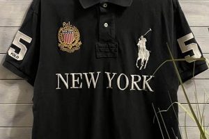
The art of recreating or imitating apparel graphics from past erastypically the 1920s to the 1990sconstitutes a specific niche within apparel design. These graphics frequently incorporate elements such as distressed textures, retro fonts, and imagery representative of bygone trends and cultural phenomena. For instance, a graphic featuring a faded band logo from the 1970s on a heather gray shirt exemplifies this style.
This aesthetic holds considerable appeal due to its association with authenticity, nostalgia, and individuality. It allows consumers to express their personal style through references to specific periods or subcultures, offering a unique alternative to contemporary fashion trends. Historically, the resurgence of this approach reflects cyclical patterns in fashion, where styles from previous decades are reinterpreted and adapted for modern audiences.
The subsequent sections of this article will delve into the various techniques employed in creating such apparel, the prevalent design themes, and the market forces driving its ongoing popularity.
Tips for Effective Vintage Apparel Graphics
The following guidelines provide insight into creating compelling apparel graphics that emulate a classic aesthetic.
Tip 1: Research Historical Accuracy: Thoroughly investigate design trends, typography, and imagery prevalent during the target era. Authenticity enhances the graphic’s credibility.
Tip 2: Utilize Distressed Textures: Incorporate subtle distressing effects, such as fading, cracking, and graininess, to simulate the wear and tear characteristic of older garments. This can be achieved digitally or through specialized printing techniques.
Tip 3: Employ Period-Appropriate Typography: Select fonts that were widely used during the intended decade. Refer to historical advertisements, posters, and signage for reference. A sans-serif font popular in the 1960s, for instance, would be inappropriate for a design aiming to evoke the 1930s.
Tip 4: Consider Color Palettes: Colors fade and shift over time. Research the specific hues and tones that were common in the past, accounting for the effects of age and sunlight exposure. Sepia tones and muted color schemes are often effective.
Tip 5: Incorporate Relevant Imagery: Use illustrations, photographs, or iconography that resonate with the targeted historical period. Avoid modern elements that would detract from the graphic’s overall authenticity.
Tip 6: Pay Attention to Print Methods: Research printing techniques used in the past, such as screen printing with plastisol inks, and attempt to replicate their visual characteristics. Modern digital printing, while convenient, may require adjustments to achieve a true vintage look.
Tip 7: Subtlety in Design: Avoid overly complex or busy graphics. Classic apparel graphics often feature simple, bold designs with clear messaging. The focus should be on capturing the essence of the era, not overwhelming the viewer with information.
Implementing these suggestions can significantly enhance the authenticity and appeal of apparel graphics, attracting consumers who appreciate a blend of classic style and contemporary design.
The subsequent section will examine the marketing strategies employed to effectively promote and sell these specialized garments.
1. Authenticity
In the realm of vintage apparel graphics, authenticity serves as a cornerstone of successful design and market appeal. It represents a commitment to accurately reflecting the aesthetic, cultural, and historical context of a specific era, thereby fostering a sense of genuine connection with consumers seeking a tangible link to the past.
- Historical Accuracy in Imagery
The selection of imagery must align precisely with the targeted period. This entails rigorous research to identify appropriate illustrations, photographs, and iconography. Depicting a vehicle model that debuted after the intended era, for example, would immediately undermine the graphic’s authenticity. Accurate representation of fashion, technology, and societal norms is crucial.
- Typographical Fidelity
Fonts are potent signifiers of time periods. Using a modern, digitally-designed typeface on a graphic intended to evoke the mid-20th century would be incongruous. Designers must diligently research and employ typefaces that were commercially available and widely used during the relevant era. Attention to details such as letter spacing and kerning further contributes to typographical fidelity.
- Material and Production Method Consistency
The tactile and visual properties of a graphic are significantly influenced by the materials and production methods employed. Simulating the subtle imperfections and textures characteristic of older printing techniques, such as screen printing with plastisol inks, enhances the perceived authenticity. Selecting appropriate fabric weights and weaves further contributes to a cohesive vintage aesthetic.
- Cultural Contextualization
Beyond technical accuracy, a truly authentic apparel graphic reflects the cultural milieu of the targeted period. This involves understanding the prevailing social attitudes, political climate, and popular trends. The graphic should not only look the part but also resonate with the spirit of the era, avoiding anachronistic or culturally insensitive depictions.
By meticulously attending to these facets, designers can create apparel graphics that transcend mere imitation and achieve a level of authenticity that resonates with consumers seeking a genuine connection to the past. The pursuit of authenticity, therefore, is not simply a stylistic choice but a strategic imperative for success in the vintage apparel market.
2. Typography
Typography forms a critical component of achieving an authentic representation. The selection of typefaces exerts a substantial influence on the perceived era of a design. Incorrect fonts undermine credibility, regardless of other design elements. Period-accurate fonts effectively signal the targeted time, thereby enhancing overall cohesion. For instance, the use of a Futura typeface evokes a distinctly 1920s-1930s Art Deco sensibility, while employing a Helvetica typeface implies a mid-century modern aesthetic. Understanding the historical context and application of specific fonts is essential for effective execution.
The practical significance of font selection extends beyond mere aesthetics. Typefaces convey implicit messages and cultural associations. A bold, sans-serif font might represent the optimism of the post-war era, whereas a distressed, hand-drawn font might evoke the counter-cultural movements of the 1960s. Furthermore, accurate typography directly affects readability and legibility. Selecting a font that was originally designed for signage might be inappropriate for smaller text sizes on apparel. Careful consideration of font weight, letter spacing, and kerning is paramount to ensure clarity and visual appeal. Reproduction of vintage advertising materials serves as a valuable resource for appropriate font choices. Brands aiming to evoke a specific era often invest in custom typefaces that capture the nuances of the past, further enhancing their commitment to authenticity.
In summary, typography constitutes an indispensable aspect of graphics. Precise font selection contributes significantly to the authenticity and visual impact of the final product. While challenges exist in identifying and sourcing period-accurate fonts, particularly for lesser-known typefaces, the effort yields substantial returns in terms of design credibility and market appeal. The deliberate use of typography reinforces the overall theme and strengthens the connection with consumers seeking a genuine representation of bygone eras.
3. Color Palette
The selection of a color palette is fundamental to successful creation. Colors possess the capacity to evoke specific temporal associations, rendering their accurate application crucial for establishing authenticity. The passage of time induces alterations in color perception due to factors such as fading, oxidation, and dye degradation. Reproducing these effects requires careful consideration of historical color trends and the simulation of age-related modifications. For instance, bright, saturated hues common in the 1980s would be inappropriate for a graphic intended to represent the 1950s, where more muted and pastel shades predominated. Consequently, understanding historical color standards and the effects of time on pigments is essential for generating credible designs.
Practical application necessitates a multi-faceted approach. First, research of period-specific color charts and historical product catalogs provides a foundation for accurate color selection. Secondly, digital tools capable of simulating color fading and aging allow designers to replicate the nuances of older apparel. Consider, for example, the effect of prolonged sun exposure on red dyes, which often shifts towards orange or pink. Implementing these subtle shifts enhances the perceived authenticity of the graphic. Additionally, the choice of fabric influences the final color rendering. Certain materials, such as cotton, exhibit a higher degree of dye absorption compared to synthetics, affecting the overall saturation and tone. Therefore, the fabric selection must complement the intended color palette to achieve the desired effect.
In summary, the color palette is an indispensable element. Accurate application, achieved through diligent research and simulation techniques, contributes substantially to its visual impact and overall appeal. While challenges exist in replicating the subtle nuances of aged colors, mastering this aspect is essential for creating designs that resonate with consumers seeking a genuine connection to the past. The deliberate and informed use of color reinforces the overarching theme and strengthens the perceived authenticity of the design.
4. Imagery
Imagery serves as a primary vehicle for conveying historical context and establishing authenticity within the sphere of apparel graphics. The selection and execution of visual elements directly influence the perception of age and adherence to specific temporal aesthetics. Inappropriate or anachronistic imagery undermines the overall credibility of a design, regardless of other stylistic considerations. The inclusion of period-specific automobiles, logos, or cultural symbols, conversely, significantly reinforces the intended vintage appeal. The cause-and-effect relationship is clear: careful selection yields a convincing aesthetic, while negligent choices result in a flawed and unconvincing pastiche.
The practical significance of understanding this connection lies in its ability to inform design decisions and enhance market appeal. Consider, for example, a design intended to evoke the 1970s. Incorporating imagery related to disco music, bell-bottom jeans, or the early personal computer revolution would resonate with consumers familiar with that era. Conversely, including modern smartphone graphics would be jarring and detract from the intended effect. Moreover, the style of the imagery is equally important. Line art, halftone patterns, and hand-drawn illustrations were prevalent in certain periods, and replicating these techniques further contributes to the authenticity.
In conclusion, imagery is a pivotal component, directly impacting the success of replicating a vintage aesthetic. The challenge lies in the thorough research required to identify and accurately represent period-specific visual elements. Overcoming this challenge, however, yields significant benefits in terms of design integrity and consumer perception, solidifying its role within the broader thematic framework.
5. Distressing
Distressing, in the context of apparel graphics, refers to techniques employed to artificially create the appearance of wear, age, and imperfection. This is a critical component of achieving an authentic aesthetic, simulating the effects of time, washing, and use on apparel. Its importance stems from the inherent association consumers have with the past: older garments are often characterized by faded colors, cracked prints, and softened fabrics. The cause-and-effect relationship is direct; proper execution of distressing techniques results in a more believable and desirable visual outcome, while its absence or improper application can undermine the entire design. For example, a graphic utilizing modern, crisp lines and vibrant colors, lacking any sign of artificial wear, would appear incongruous with a “vintage” label. Brands like Lucky Brand and Levi’s often incorporate deliberate distressing into their apparel to enhance its retro appeal.
Practical application necessitates a nuanced understanding of various distressing methods. These include techniques like: digitally adding textures to simulate cracked ink or faded colors, physically abrading the fabric to soften fibers, and utilizing specialized washes to lighten or alter the dye. Selection of appropriate techniques depends on the desired degree of wear and the specific aesthetic being targeted. Over-distressing can appear artificial and detract from the design, whereas insufficient distressing may fail to convey the intended effect. Furthermore, understanding the natural aging process of different materials is essential. Cotton, for example, fades and softens differently than polyester, and replicating these unique characteristics enhances the overall authenticity. Certain manufacturers even utilize specialized equipment to replicate the precise wear patterns of actual vintage garments.
In summary, the effectiveness of distressing techniques significantly impacts the overall success of replicating a classic look. While challenges exist in achieving a balance between believable wear and over-exaggeration, the benefits of a well-executed distressing strategy are undeniable. Understanding the nuances of different distressing methods, materials, and historical aging patterns is essential for designers seeking to create compelling and convincing. Accurate utilization elevates the garment from a simple imitation to a desirable and authentic item, resonating strongly with consumers seeking a genuine connection to the past.
6. Fabric
The choice of fabric is intrinsically linked to the authenticity and overall aesthetic of apparel graphics. It extends beyond mere functional considerations, influencing both the visual appearance and tactile experience of the garment. The selection of inappropriate fabric can undermine the most meticulously crafted design, while a deliberate choice can elevate the graphic to a new level of historical accuracy.
- Fiber Composition
The fiber content of the fabric, such as cotton, polyester, or blends, significantly affects its drape, texture, and aging characteristics. Historically, 100% cotton was the predominant fiber used in apparel manufacturing. Replicating this fiber composition is essential for achieving a truly authentic feel. The use of modern synthetic blends can detract from the perceived genuineness, as these fabrics often exhibit different shrinkage rates, drape qualities, and responses to wear and washing.
- Weave and Knit Structure
The weave or knit structure of the fabric determines its surface texture and visual appearance. Common weaves include plain weave, twill weave, and satin weave, while knit structures encompass jersey knit, rib knit, and interlock knit. Replicating the weave or knit structure common during the targeted historical period is crucial. For example, a jersey knit was widely used, while a pique knit may be historically inaccurate. Different weaves/knits impact the print quality and how the design ages.
- Weight and Thickness
The weight and thickness of the fabric, measured in ounces per square yard or grams per square meter, influences its drape, feel, and durability. Heavier-weight fabrics were often used, providing a more substantial and durable feel. The use of lightweight fabrics can create a flimsy and inauthentic impression. Selecting a fabric weight that aligns with historical norms is essential for conveying the correct era.
- Dyeing and Finishing Processes
The dyeing and finishing processes applied to the fabric affect its color, texture, and performance characteristics. Historically, natural dyes and simpler finishing techniques were employed, resulting in fabrics with a softer hand and a more muted color palette. Modern dyeing and finishing processes can produce fabrics with excessive brightness or a harsh feel, detracting from the aesthetic. Choosing fabrics that have been dyed and finished using methods that replicate historical processes is essential for achieving a truly appearance.
In summary, fabric considerations are indispensable. Authentic fiber composition, weave/knit, weight/thickness, and finish all affect the outcome. Failure to consider this results in products that are not truly authentic.
7. Printing
The printing method employed is a determining factor in achieving the desired visual and tactile qualities. It directly impacts the ink’s opacity, texture, and durability, thereby contributing significantly to the overall perception of age and authenticity. Cause-and-effect relationships are evident: the use of modern digital printing on garments intended to evoke a mid-century aesthetic often results in a sharp, vibrant image that contrasts starkly with the subtle imperfections and softer textures characteristic of older prints. In contrast, utilizing screen printing techniques, particularly those employing plastisol inks (which are then appropriately distressed), can more closely approximate the look and feel of vintage graphics. Numerous brands successfully leverage this connection; consider how vintage concert tees often employed simple, single-color screen prints. Understanding this connection is practically significant, as it guides designers toward selecting the appropriate printing method to achieve the desired visual outcome.
Further analysis reveals the nuanced interplay between printing techniques and design elements. For example, halftone patterns, a common feature of older printing methods, can be digitally simulated to replicate the characteristic dot-matrix appearance. Similarly, the deliberate application of imperfections, such as misregistration or ink bleed, can enhance the perceived authenticity. Brands that specialize in vintage reproductions, such as those featured on Etsy or specializing in vintage band t-shirts, often employ these techniques. In terms of practical application, designers must carefully consider the image resolution, ink type, and printing surface to achieve the desired effect. The choice of mesh screen for screen printing, for instance, directly impacts the level of detail that can be achieved. Similarly, the use of water-based inks can create a softer feel compared to plastisol inks, which may be desirable depending on the specific aesthetic being pursued.
In summary, is an indispensable element. The careful selection and execution of appropriate techniques, such as screen printing with simulated halftone patterns and deliberate imperfections, are crucial for replicating vintage aesthetics. While challenges exist in mastering these techniques and achieving consistent results, the benefits are undeniable. The informed use of printing reinforces the overall theme and strengthens the connection with consumers seeking a genuine impression of eras past.
Frequently Asked Questions
The following questions address common inquiries and misconceptions surrounding techniques. Understanding these nuances can assist both designers and consumers in appreciating the intricacies of the craft.
Question 1: What defines an apparel graphic as “vintage”?
A designation is typically applied to graphics that emulate the design aesthetics, printing techniques, and cultural references of apparel produced during specific historical periods, generally spanning the 1920s to the 1990s. Key indicators include the use of period-appropriate typography, distressed textures, and imagery representative of the targeted era.
Question 2: How crucial is historical accuracy in creating authentic designs?
Historical accuracy is paramount. Meticulous research into design trends, typography, color palettes, and imagery prevalent during the targeted era is essential for achieving a credible and compelling result. Inaccuracies can undermine the entire design, diminishing its value to consumers seeking authenticity.
Question 3: Are digital tools sufficient for replicating a truly appearance?
Digital tools can be highly effective in simulating certain aspects, such as distressing effects and halftone patterns. However, achieving a truly authentic result often requires a combination of digital techniques and an understanding of traditional printing methods, such as screen printing, to replicate the nuances of ink application and texture.
Question 4: Why is fabric selection so important?
The choice of fabric directly influences the visual appearance, tactile feel, and aging characteristics of the apparel graphic. Fiber composition, weave structure, and weight all contribute to the garment’s overall authenticity. Selecting fabrics that align with historical norms is essential for conveying the intended era.
Question 5: What are the key differences between modern and techniques?
Modern printing techniques often prioritize sharpness, vibrancy, and durability, whereas replicate the subtle imperfections, faded colors, and softer textures characteristic of older prints. Screen printing, with the deliberate application of distressing effects, is a common technique employed in apparel.
Question 6: How can consumers differentiate between a well-executed piece and a poor imitation?
Consumers can assess the authenticity by examining the details. Look for accurate typography, distressed textures that appear natural rather than artificial, a color palette that aligns with the targeted era, and a printing method that simulates the characteristics of older techniques. Researching historical apparel can provide valuable context for evaluating authenticity.
In summary, creating compelling graphics requires a meticulous approach, blending historical research, technical expertise, and a keen eye for detail. Understanding the nuances of design, printing, and fabric selection is essential for achieving a truly authentic result.
The subsequent section will explore the market dynamics influencing the demand for this specific apparel category.
Vintage T Shirt Design
This article has explored the multifaceted nature of replicating apparel graphics, emphasizing the critical role of authenticity, typography, color palettes, imagery, distressing, fabric selection, and printing techniques. The pursuit of an accurate and compelling outcome necessitates meticulous research, technical proficiency, and a keen awareness of historical context. The integration of these elements elevates what would be a mere imitation to one that resonates with consumers valuing this distinct aesthetic.
Continued demand for these apparel graphics suggests an enduring appreciation for the tangible connections to past eras. Designers and manufacturers must uphold rigorous standards to maintain authenticity. Future trends may incorporate enhanced digital simulations and novel printing techniques, but the foundational principles of historical accuracy and meticulous detail will remain essential. Recognizing the value of meticulous craft ensures the integrity and continued appeal of apparel graphics.


